Brand system
Ligasol brand guidelines
One consistent identity across website, documents, email and social media — built on Deep Navy, Royal Blue and precise German typography.

The ZIP contains every deliverable on this page: logos, favicons, stationery PDFs with their editable SVG masters, social templates, email signatures, design tokens and the guidelines document.
01 — Logo
Logo suite
A geometric “L” built from a stem and foot, with three modules ascending on a 45° axis: precision, modular growth and forward movement.
Icon only
Do
- Use the supplied SVG files without redrawing.
- Place the primary lockup on white, Light Grey or a clean photograph.
- Use the reversed lockup on Deep Navy or dark imagery.
- Keep the icon modules in the ascending 45° order.
Don’t
- Don't stretch, rotate, skew or re-space the lockup.
- Don't recolour the wordmark or modules outside the palette.
- Don't add shadows, outlines, gradients or effects.
- Don't place the primary lockup on busy or low-contrast backgrounds.
Clear space. Minimum clear space equals the height of the logo icon on all four sides.
Minimum size. Horizontal lockup: 120 px / 32 mm wide. Icon: 16 px / 6 mm.
- Primary horizontal (SVG)Default for web headers, letterhead and documents.
- Horizontal — reversedFor navy and photographic backgrounds.
- Horizontal — mono navySingle-colour print, engraving, fax.
- Stacked (SVG)Square formats, social profiles, signage.
- Stacked — reversedStacked lockup on navy.
- Stacked — mono navySingle-colour stacked lockup.
- Icon only (SVG)Favicon, app icon, avatars, watermarks.
- Icon — reversedIcon on navy backgrounds.
- Icon — navy tilePre-composed navy tile for social avatars.




02 — Colour
Colour palette
Deep Navy carries authority, Royal Blue signals innovation, greys keep documents calm and legible. Every value is a theme token, so web, print and email match exactly.
Deep Navy
#16274C
--navy
Primary brand colour: logo, headers, dark panels, primary buttons.
Charcoal Navy
#081431
--navy-deep
Deepest shade for gradients, footers and presentation covers.
Navy Soft
#314C7E
--navy-soft
Secondary navy for borders on dark, hover states and dividers.
Royal Blue
#286CAB
--steel
Accent colour: links, icons, active states, logo module 3.
Signal Blue
#89B3D8
--chart-4
Light accent on navy, logo module 1, data visualisation.
Steel Grey
#5E6774
--muted-foreground
Body copy support, captions, logo descriptor line.
Charcoal Black
#181F2E
--foreground
Primary text colour on light surfaces.
Light Grey
#F4F6F8
--surface
Section backgrounds, cards, table zebra rows.
Grey Line
#DFE3E8
--border
Borders, rules, table lines, input outlines.
White
#FFFFFF
--background
Primary background, logo clear space, stationery paper.
Contrast: Charcoal Black on White and White on Deep Navy both exceed WCAG 2.1 AA for body text. Royal Blue is used for links and icons on white or Light Grey only; on navy, switch to Signal Blue.
03 — Typography
Typography
Sora for structure and headlines, Manrope for readable body copy — both Google Fonts, loaded non-blocking for fast rendering.
Display · Sora
Aa Bb Cc 0123
Weights 400 / 600 / 700 — Headlines, logo wordmark, statistics, section titles.
Body · Manrope
Aa Bb Cc 0123
Weights 400 / 500 / 600 / 700 — Body copy, navigation, UI labels, documents and email.
| Style | Font | Size | Weight |
|---|---|---|---|
| Display | Sora | clamp(2.5rem, 1.6rem + 3.2vw, 4rem) | 700 |
| Heading 1 | Sora | clamp(2rem, 1.4rem + 2.2vw, 3rem) | 700 |
| Heading 2 | Sora | clamp(1.5rem, 1.2rem + 1.1vw, 2rem) | 600 |
| Heading 3 | Sora | clamp(1.125rem, 1rem + 0.5vw, 1.375rem) | 600 |
| Body | Manrope | 1rem / 1.7 | 400 |
| Small | Manrope | 0.875rem / 1.6 | 400 |
| Eyebrow | Manrope | 0.75rem, uppercase, 0.18em | 700 |
04 — Icons
Icon system
2px rounded stroke icons on a 24 × 24 grid. One family only (lucide-react) — never mix filled and outline styles.
Sizes: 16 / 20 / 24 / 32 px. Colour: Royal Blue #286CAB on light, Signal Blue #89B3D8 on navy. Icons are always decorative next to a text label and marked aria-hidden.
05 — UI kit
Design tokens & components
Radii, spacing and motion are shared by every page, so new sections inherit the brand without extra styling decisions.
Radius
- sm0.25rem
- md0.375rem
- lg0.5rem
- xl0.75rem
- 2xl1rem
Spacing
- Section (mobile → desktop)clamp(3.5rem, 2.5rem + 4vw, 6.5rem)
- Container max width80rem with 1.25rem–2rem gutters
- Card padding1.5rem → 2rem
- Grid gap1rem → 2rem
Motion
- Duration180ms (UI) / 600ms (reveal)
- Easingcubic-bezier(0.22, 1, 0.36, 1)
- All motion is suppressed under prefers-reduced-motion: reduce.
Components
Service card
Icon, title, two-line description. Border, radius lg, padding 1.5–2 rem.
06 — Favicon package
Favicon & app icons
Generated from the icon-only mark, from 16 × 16 up to the 180 × 180 Apple touch icon, plus a PWA manifest.
 180×180
- favicon.svgVector favicon, scales to any size.
- favicon.ico (16/32/48)Legacy browser support.
- favicon-16x16.pngBrowser tab.
- favicon-32x32.pngBrowser tab, retina.
- favicon-48x48.pngWindows shortcut.
- android-chrome-192x192.pngAndroid home screen.
- android-chrome-512x512.pngPWA splash / store icon.
- apple-touch-icon.png (180×180)iOS home screen.
- site.webmanifestPWA manifest referencing the icon set.




07 — Stationery
Business stationery
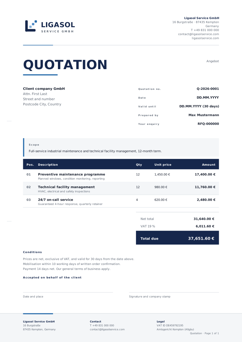
Print-ready PDF templates plus the editable SVG masters, all using the same margins, rules and typography as the website.
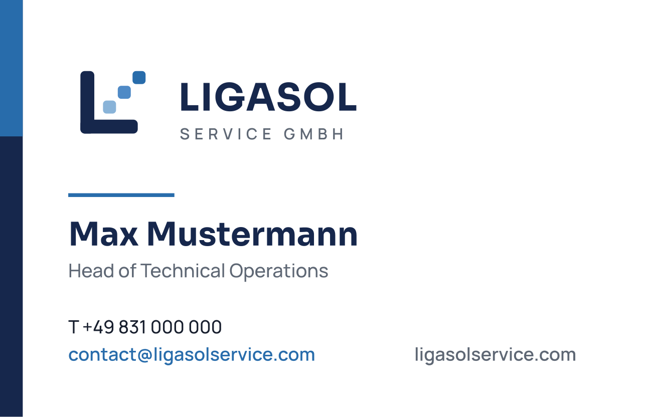
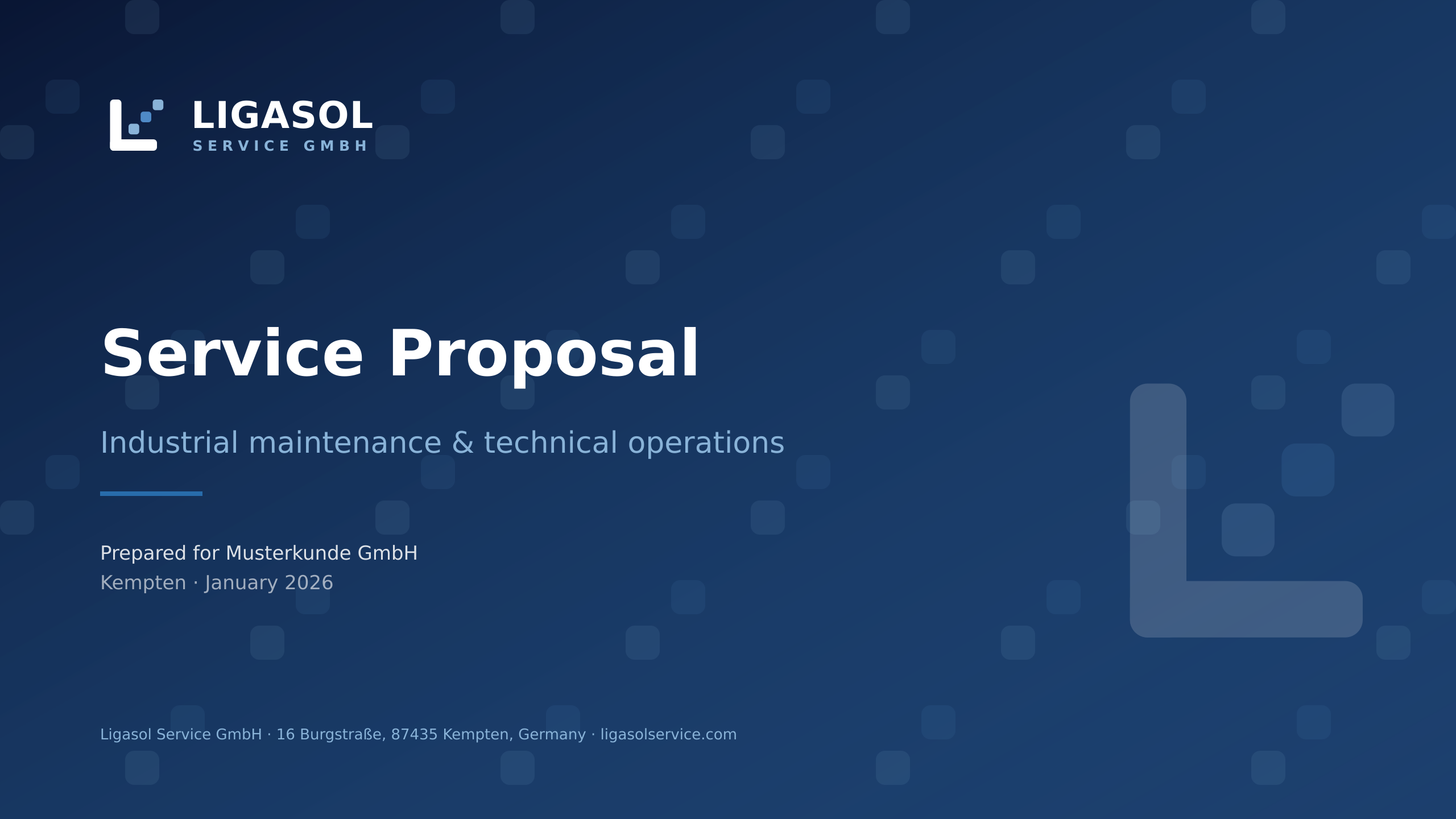
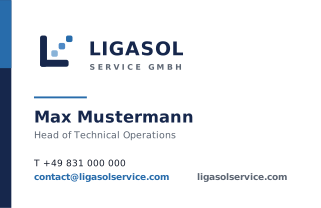
- Business card (85 × 55 mm, PDF)Two pages: front and back, print-ready.
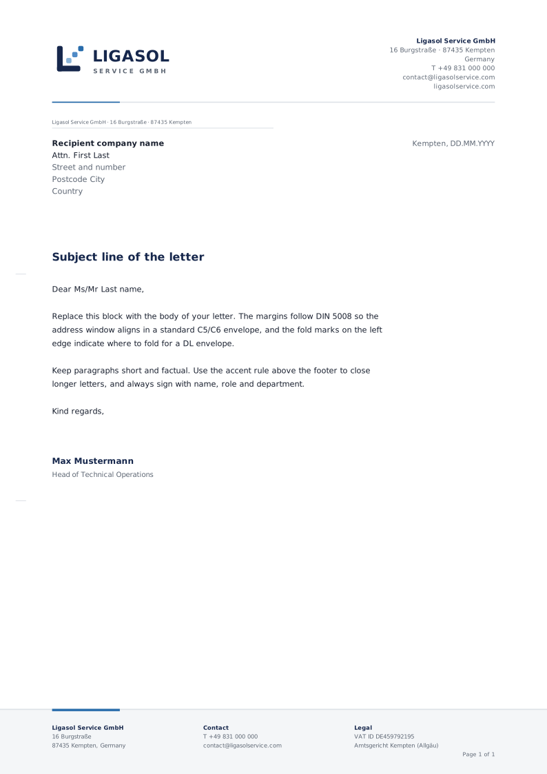
- Letterhead A4 (PDF)DIN 5008 margins, fold marks and footer block.
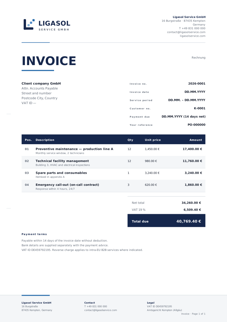
- Invoice template A4 (PDF)German invoice requirements incl. VAT ID.
- Quotation template A4 (PDF)Offer layout with validity, scope and signature block.
- Presentation cover 16:9 (PDF)Proposal and deck title slide.
Editable source files
Every template ships as an SVG master with live text — open it in Figma, Illustrator, Affinity Designer or Inkscape, replace the placeholders and re-export.
- Business card — front (SVG)Editable: name, role, phone.
- Business card — back (SVG)Navy reverse with claim line.
- Letterhead A4 (SVG)Live text, DIN 5008 address field.
- Invoice A4 (SVG)Editable line items and totals.
- Quotation A4 (SVG)Editable scope, conditions and signatures.
- Editing & print guide (Markdown)Fonts, palette, paper stock, regeneration commands.

08 — Social
Social media & sharing assets
Platform-correct sizes with the reversed lockup, tagline and domain kept inside each safe area.

- LinkedIn banner — 1584 × 396Company page cover.
- Facebook cover — 1640 × 624Page cover, safe area centred.
- X / Twitter header — 1500 × 500Profile header.
- YouTube channel art — 2560 × 1440Content inside the 1546 × 423 safe area.
- Instagram profile — 1080 × 1080Square post / profile card.
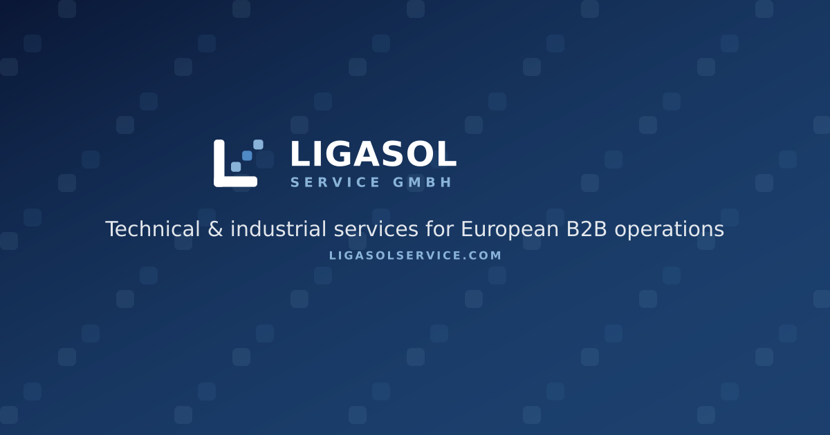
- Open Graph image — 1200 × 630Link previews (also used site-wide).

Campaign templates
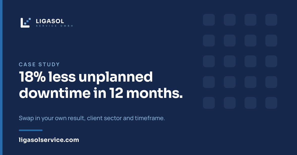
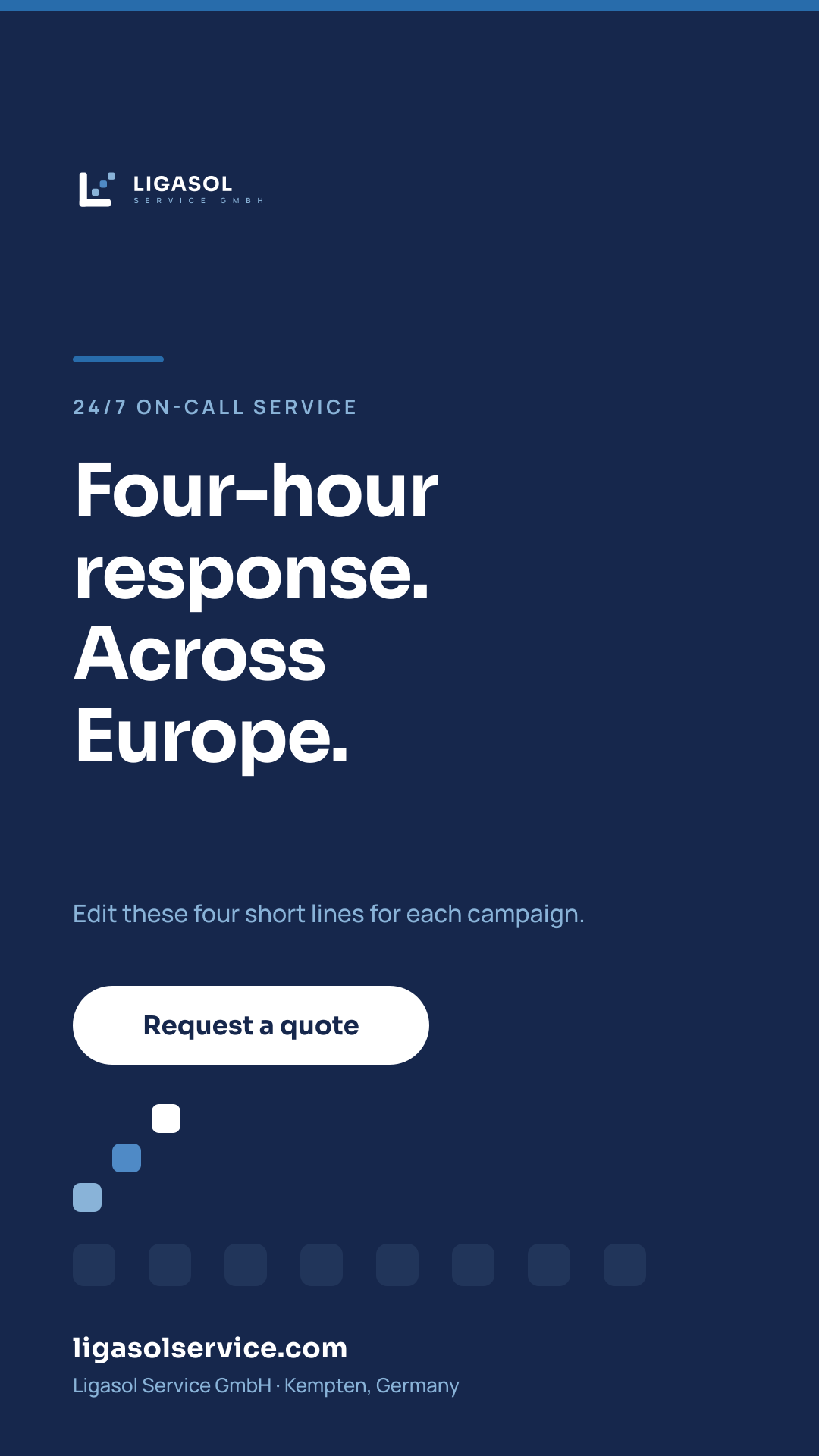
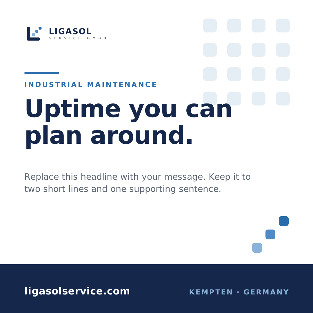
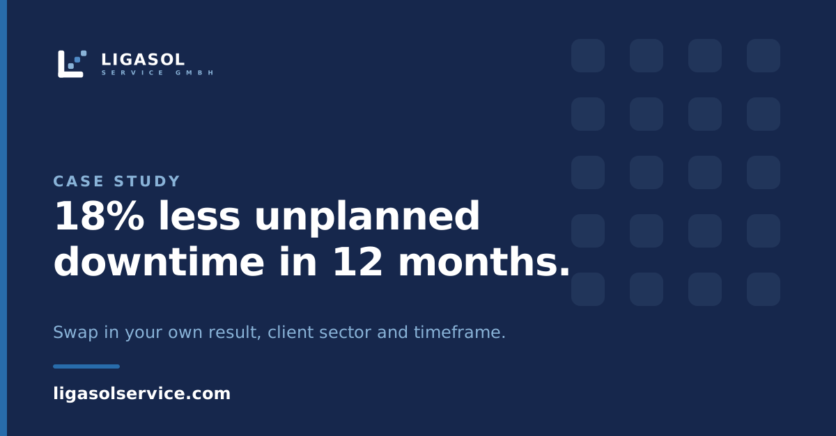
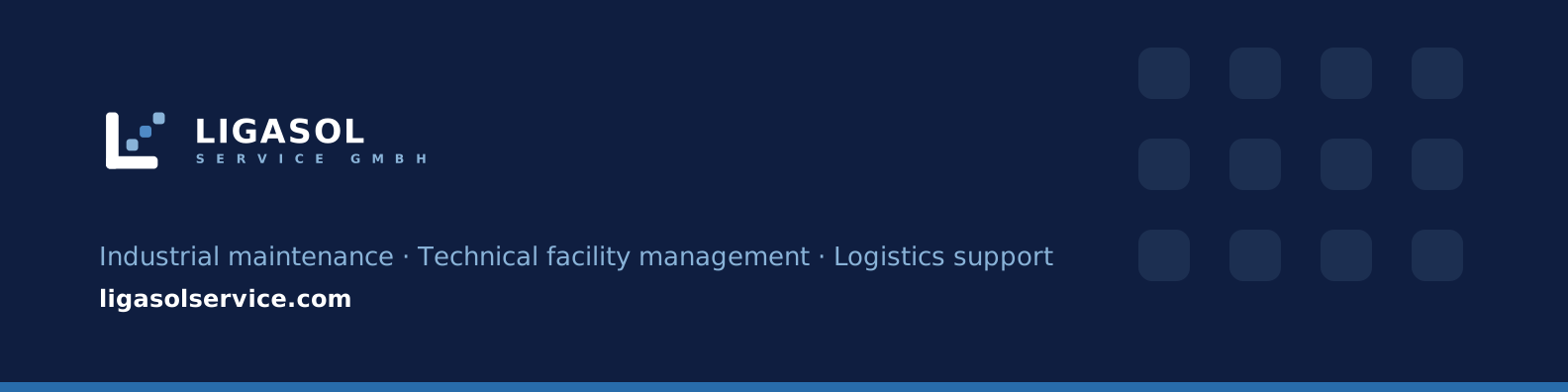
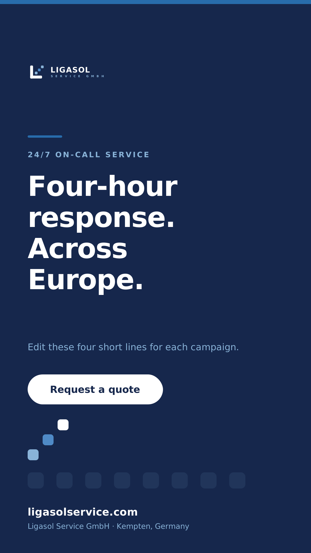
Reusable post, banner and story layouts. Swap the eyebrow label, headline and supporting line for each campaign — the grid, margins and colour ratios stay fixed.
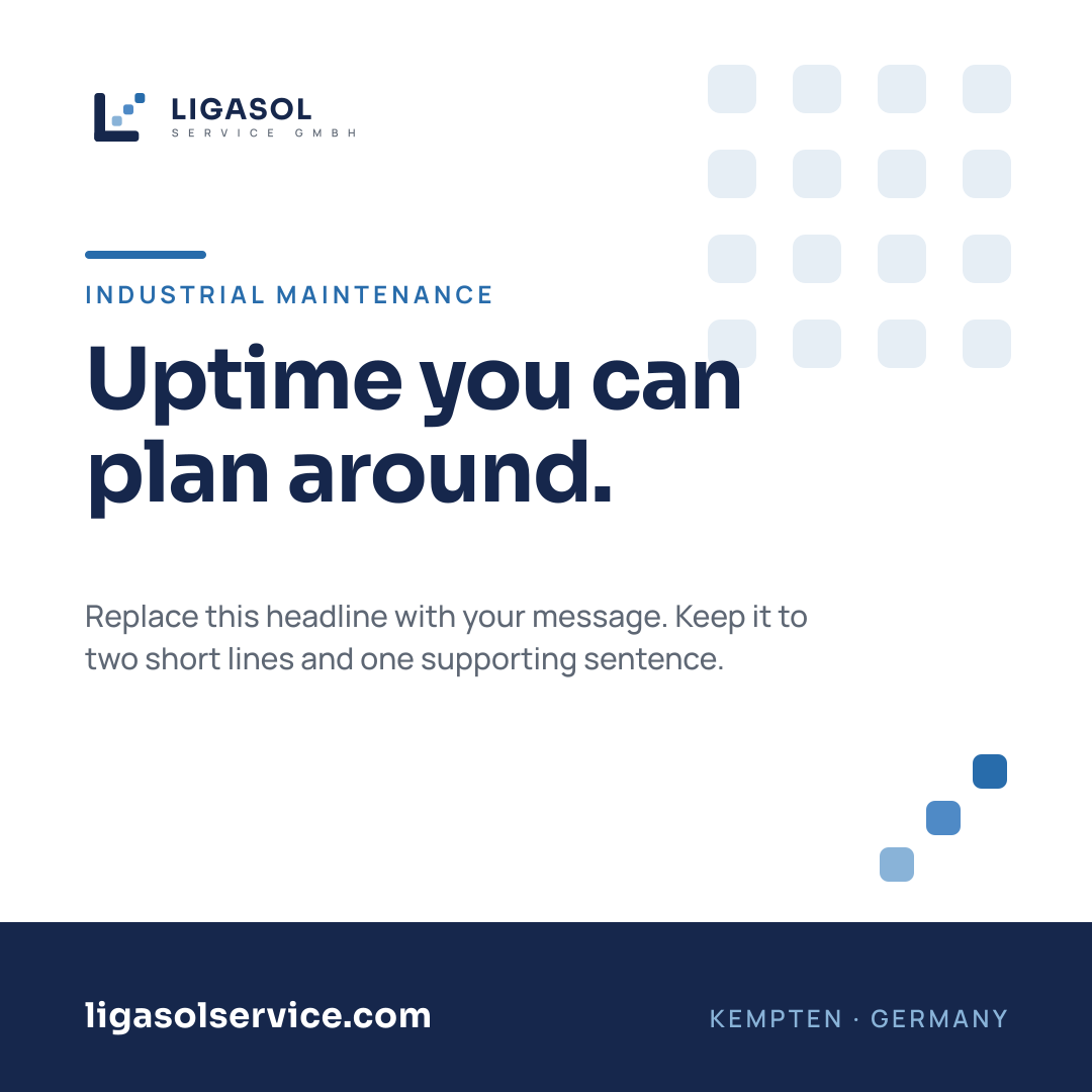
- Feed post, square — 1080 × 1080 (PNG)LinkedIn, Instagram and Facebook feed.
- Feed post, landscape — 1200 × 627 (PNG)LinkedIn link post and X post.
- Company banner — 1584 × 396 (PNG)LinkedIn banner; crops safely for X and Facebook.
- Story / reel cover — 1080 × 1920 (PNG)Instagram and LinkedIn stories, clear of platform UI.

- Feed post, square (SVG)Live text: eyebrow, two headline lines, support copy.
- Feed post, landscape (SVG)Editable case-study / result layout.
- Company banner (SVG)Editable service line and domain.
- Story / reel cover (SVG)Four-line headline block with CTA pill.
- Template & safe-area guide (Markdown)Sizes, safe areas, fonts, re-export commands.
09 — Email
Email signatures
Light and dark variants in HTML and RTF, using the same navy, royal blue and typographic hierarchy as the letterhead.
Light variant

Max Mustermann
Head of Technical Operations
Ligasol Service GmbH
16 Burgstraße, 87435 Kempten, Germany
T +49 (0) 831 000 000 · contact@ligasolservice.com
ligasolservice.com
VAT ID DE459792195 · Register court Kempten
Dark variant

Max Mustermann
Head of Technical Operations
Ligasol Service GmbH
16 Burgstraße, 87435 Kempten, Germany
T +49 (0) 831 000 000 · contact@ligasolservice.com
ligasolservice.com
VAT ID DE459792195 · Register court Kempten
- Email signature — light (HTML)Default. Table-based, inline styles, Outlook-safe.
- Email signature — dark (HTML)For dark-themed compose windows and clients.
- Email signature — light (RTF)Outlook for Windows / Word, logo embedded.
- Email signature — dark (RTF)Dark variant with embedded reversed logo.
- Installation guide (Markdown)How to install in Outlook, Gmail and Apple Mail.
Related pages
Where the brand is applied
The same tokens, icons and section rhythm run across every page of the site.